Tuesday, 23 November 2010

Final Magazine- Contents Page


This is my final design for my contents page. Once again i have followed the rules of thirds, to keep things equal. For my title, i have made it the same colour as the jumper on the picture of my model, so that it all links together. The second picture i have used has been circled to make the page more interesting and to make it different. I have used the colour black for my text, as it is easy to read and also partially links to the pictures. I am not too sure about this contents page, as I was not sure what to put on this page or how to make it look even.

This is my new and improved version. I have made the text into a thinner line, so that is applies to the rules of thirds more. I also moved the text to the other side so that I could have the photo of my model facing inwards, therefore introducing the reader into the magazine.

Thursday, 18 November 2010

Final Magazine- Front Cover


This is the final design for the front cover of my magazine. I have used the rule of thirds so that everything looks equal, however because my photograph does not follow the rule of thirds i have to change some of it around. I tried to keep to a limited amount of colours,as if there are too many colour it gets confusing, so i stuck with white from the top, gold from the racket, purple from the jumper and black from the trousers/shoes. All of the text is linked to what is mentioned in the context page, just like the photograph.


This is my improved version, and very final. I removed some of the text, as it appeared too busy, it is easier to focus, when there is less things present.

Sunday, 31 October 2010

Contents page research

This is the first contents page i found and my inital thought is that it is very simple yet bold. The bright colour really catches your eye, but has little relevance to the photograph. The overlapping titles is too busy and distracting, and makes it hard to read what the say. The picture does not really fit with the magazine, as it looks like too people just standing there, so for my contects i will make the photo relevant.
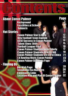
 This content page immediately gives the impression that there is too much going on, you dont know where to look first. There are too many seperate photos in the background it does not have a specific area, and is it hard to tell what the photos are actually showing due to the white, bright writing going over the top. However, the title is the same colour as the badge in the left corner which links them together and looks better than if it was a colour that was not there.

Researching photo's


This is the first photo I found, and I immediately liked it. The background is blurred out which makes the main focus the young boy with the racket. The photo has a cheerful feel to it, even though the colours are quite simple. However, the second person right at the front of the camera that is blurred, is distracting and feels like it is blocking the picutre.


I also like this picture, as firstly it fits in with the theme of my magazine, which is a sports magazine. The picture is clear and shows exactly what is happening, which is that they are in a fooball match. I wouldnt try to copy this photo, because it would be too hard to recreate, but it would fit in nicely with a sports school magazine.

Wednesday, 13 October 2010

UPDATE!

In the last couple of lesson's I have chosen the picture that I felt would be most suitable for my magazine, and I only really had one that was appropriate. I then tried many attempts of photoshopping it to make it exciting yet, would still be suitbale in colour and appearance. Also, using photoshop I managed to hide some objects in the background that ruined the picture, so that it now looks more like a school photograph.

Monday, 11 October 2010

Newest Picture

The top picture is what my photo originally looked like and the bottom one is my lastest design. I am pretty happy with this one, as it is exciting, but without being too bright. I also managed to remove the chair and swimming pool in the background by covering them up with a tree paint brush. In addition, I had to crop the picture so that it became portait instead of landscape, as if the photograph was landscape, then the it would not fit on the magazine. Lastly, i blured out the background so that it does not distract from the actual photo, I want everyone too look at.

Monday, 4 October 2010

Example of photoshopped picture

This is my first try of using photoshop on my chosen picture. I adjusted the saturation levels to give the photo a more exciting feeling, however when I view it on Gamut Warning, it showed that if i printed it out, the colours would not appear like this.

Monday, 27 September 2010

Lesson 4

In this lesson, I started my contents page. I thought of some possible headings that could be present in my magazine, and then made them the same font that my main heading would be and tried to place them in a good place on the page. I also thought again of some possible photographs that could be used for the front page of my magazine.

Picture Ideas


 Here are some photo's I have taken for my school magazine. I am unsure at the moment which one I like best.

Friday, 24 September 2010

Headings For Magazine

 This is the first page of designs I did for the Heading for my magazine. I tried a variety of different fonts, sizes and colours to come up with come good ideas.
 I then narrowed my first page down into 10 different designs that i kind of liked, and would see being the heading for my magazine. They are all very different, but all had something about them that caught my eye.
This was my last lot of designs, and I picked the two designs that i really liked the look of. I then changed them around a bit, using some of the idea's from my other pages to try and get the perfect design. I eventually came out with the design I best like the look of, which is shown at the bottom. I like the colour of the background, as it is eye catchy, but is not too bold and birght. I used the same font I used on the second from the top, and then made the outline of the words thicker so that it is easier to read, but still looks interesting.

Tuesday, 21 September 2010

Lesson 3

In this lesson we conitinued researching for our magazine. We searched for pictures that would give us inspiration for our own pictures that we will be putting on out magazine. I find a few, that i could use of clear pictures of children doing sport.

Monday, 20 September 2010

Lesson 2

In this lesson, we started researching ideas for our magazine. I got three pictures of different school magazines and wrote the positives and negatives about them. None of them were very effective in catching attention and showing what they are about. I also edited my blog to what Mr McRae wanted us to do.

Tuesday, 14 September 2010

Magazine Research

This magazine is a lot different to the others, as it is quite busy and seems that there is a lot going on at this school. The picture supports the heading down the side, so we know the magazine will be about sports. The title however, looks out of place, and gives the idea of more of a logo for a product from a supermarket. Also, the photograph is taken from a birds eye view which is very effective for this magazine, as it makes it that bit more interesting. This magazine is also too busy for me, the re is the main picture in the middle, and then there is lots of little headings and pictures going on around it. Due to this, there doesn't seem to be a clear purpose of the magazine. It says it is about Junior Athletics, but at the bottom there is a picture of the American flag and a radio which does not fit in.
 

This magazine is relatively good, as it gives an idea of what the school specialises in, as the front page is just of teenagers doing art. It also has a simple side shot of the girl, and clearly shows what she is doing. The paint brush it hard to see, as the colours blend in together, so initially we are not sure whether she is paining or not. The italic font in hard to understand, and some of it is very small which means that people may not know what exactly is in the magazine by reading that. Even though there are positives to this magazine, the overall image is very boring for me, so I will try to avoid this type of magazine when I do mine


This magazine creates a different type of feeling than the other two. The picture is extremely effective, as the boy looks like he is thinking very hard which is evidence for the heading “Generative Thinking in Independent Schools.” The picture is also quite depressing and he looks very sad, whereas the colours give a jolly feeling as they are quite bright; mainly the title. The writing on the left, is quite hard to understand. as the font is quite big and the colour is quite dark so from a distance it looks lke the letters blend in to each other.

Monday, 13 September 2010

Lesson One

In this lesson, I was new to the class so i started creating my blog. We also spoke about some school magazines and what was wrong with them, and then had to go and research about some more school magazines.