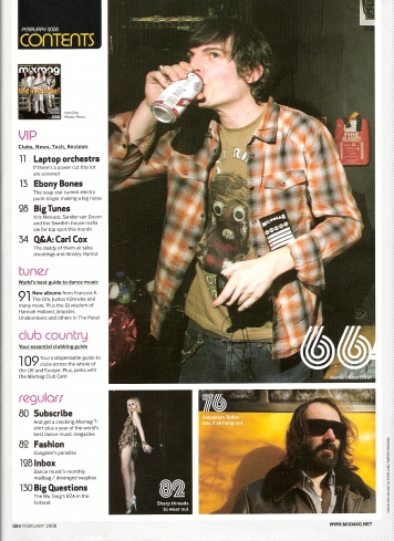
By immediately looking at this contents page, I notice that photos are featured heavily within it, therefore I will be used 1 or more photgraphs on my contents page.
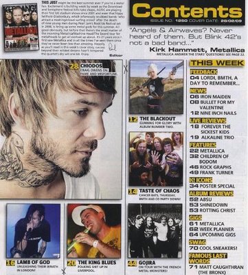
Also ,the colour of the title "contents" at the top left of the page matches some of the colours featured in the photos. For example the actual text is yellow, and the picture at the bottom right, has a yellow background.
I also noticed that underneath the title, there is in amge of the front cover, which I may also consider doing, however I can not read the writing next to it. I also like the idea of there being certain categeroies such as "VIP" and "Tunes", as it would make the contents page less confusing.

I like this contents page,as it is very different than the usual with the text being down one side wit a pictur down the other. In this contents page the photo seems to be the main focus, and catches the most attention. I do not really like the idea, of the title being in bits, as it may be hard for people to understand. In addition, the pages in this contents page, once again are in categories of "Features" and "Fashion" - therefore this will be something I will definitely consider doing. The colour theme is also very precise. The photo is mainly white/ silver, as she is wearing a silver leotard and silvery shoes. To match with this, they have made the background silver, and the white. Furthermore, the text is black which fits with the colour of her hair.

This one is very similar to the first contents page. The main text is down the left hand side, and there is a large picture to the right of it. There is also a smaller picture feature underneath, just like the first magazine. The pages listed do not come under categories, however they have a title, which is shortened to fit the top of the page, and there there is smaller writing underneath adding more description. The colour theme of Q is based on red and white, as these two colours are the colours of the title. Therefore, they have used it for the numbers and the sub-headings. The colour grey is also seen partially, and this colour can be seen in the colour of the background.

This contents page is quite different to the others, as it is mainly filled up with photographs of some of things you will see in the magazine. It has the main one, which is the largest and then all the little ones around it. I also like how it has a picture of the front cover at the top of the page and then some text by the editor. This contents page just like all the others follows a strict colour pattern. The main colours are yellow, black and grey- which can be found in most of the images. For example, the yellow can be seen on the mans t-shirt at the bottom of the magazine. This contents page also has catergories in the text and then the pages underneath. The categories are in bold, so that it makes it easier for the reader to find what they want to read. If they find the category then they can find their page quicker. They also have a quote from a person from the band Metallica underneath the contents, which is an extra feature that I have not seen in the other magazines- and i think it is quite effective, as it gives an idea of what is said in the magazine.

This magazine is similar to the one before, it has a main picture in the centre, which is most proberly for the main topic in the magazine, and then additional small ones around it. This once again follows a colour theme of red, black and white, and one bit of green. Furthermore, it does not follow the rule of thirds that well, as even though the main text is in a third, the additional things like the pictures and big headings do not. There is also the idea of the pages being under categories which all the contents pages follow, therefore I will definitely be doing this. They also have "Features" and "Regulars" which gives the idea that the magazine has some of the same things in it everyday, but also have new features such as exclusive interviews. I may also consider including this, as the reader may buy the magazine for the exclusive bit, and with this layout, they would be able to find it easier. Lastly, I like the idea of the title "contents" being on something that looks almost 3D, as it has some shadowing underneath it. It is effective, as it makes it stand out from the rest of the magazine.
Further Research
Headings
All the magazines I have looked at have a heading that says "Contents", catches the readers attention and also matches the colour theme of the magazine.
Main Image
They also have a main image which is usually the main exculsive involved in the magazine. It is usually very large, and is the first image to catch the readers attention.
Contents List
All these magazines are very similiar in that they all have a thin contents list down the left or right of the magazine. They either call it the "Features" or "This Week." They also have the number of the page in bold writing and a different colour, then a sub-heading to give a brief idea of what will be on that page/ section, and then a brief description underneath.
Image of the front cover of the magazine
I have also noticed that some of the contents pages have an image of the front cover featured some place on it. On one of the magazines it has a note from the editor next to it and the other one just has a little caption next to it.
Additional Features
Furthermore, some of the contents pages have quotes or snippets from some of the pages included in the magazine to give an idea of what it said and to interest the reader.
They also have smaller images focused around the main image which link to the pages that are shown on the contents page list. They all appear to have the page number somewhere on them also, so it seems that it is a quicker way for the reader to find what they are looking for.
 The first change I made to my contents page was to edit some of the text. I removed or changed some of the words so that most of the words were on the same line, and there was none on a line of their own. This provided more room, and ensured that the text did not look to bunched together.