
This is my final design for my contents page. Once again i have followed the rules of thirds, to keep things equal. For my title, i have made it the same colour as the jumper on the picture of my model, so that it all links together. The second picture i have used has been circled to make the page more interesting and to make it different. I have used the colour black for my text, as it is easy to read and also partially links to the pictures. I am not too sure about this contents page, as I was not sure what to put on this page or how to make it look even.

This is my new and improved version. I have made the text into a thinner line, so that is applies to the rules of thirds more. I also moved the text to the other side so that I could have the photo of my model facing inwards, therefore introducing the reader into the magazine.


 This is the first contents page i found and my inital thought is that it is very simple yet bold. The bright colour really catches your eye, but has little relevance to the photograph. The overlapping titles is too busy and distracting, and makes it hard to read what the say. The picture does not really fit with the magazine, as it looks like too people just standing there, so for my contects i will make the photo relevant.
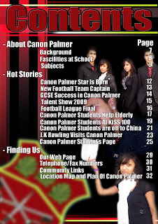 This content page immediately gives the impression that there is too much going on, you dont know where to look first. There are too many seperate photos in the background it does not have a specific area, and is it hard to tell what the photos are actually showing due to the white, bright writing going over the top. However, the title is the same colour as the badge in the left corner which links them together and looks better than if it was a colour that was not there.


