Tuesday 29 March 2011

Candidate Information

Candidate Name:
Zoe Richardson

Candidate Number:
5095

Centre Name:
Wilmington Grammar School For Girls

Centre Number:
61119

Friday 25 March 2011

Evalutation Question 7

7) Looking back at your Preliminary Task. What have you learnt in the progression from it to the full product?

make a gifanimated gif maker

At the beginning of the year we had to create a school magazine which was our preliminary task, from then until the music magazine I have made now, I have learnt a lot.

Firstly, for the preliminary task, I was very new to being creative and imaginative and did not have that much experience in researching. This meant that for this task I did not do that much research, which evidenally meant that my final product was not that good, as I did not have that much insight into the magazine world. However, this helped in creating a better music magazine, as this thime round I knew I had to do thorough research to have an efficient end result. From the research I could recieve ideas and inspiration and know what type of features are included when creating a music magazine.

Next, I learnt how to manage my time. With the preliminary task I was not sure how to use the programmes such as InDesign, Photostop and Blogger, therefore it took me much longer to get going. However, for the music magazine I was much more aware of how to use the programmes and therfore managed my time much more efficiently- as I know how long everything would take and what I was doing.

The programmes used throughout the year were very new, and it took me a while to learn. Looking back at the preliminary task to now, it is clear that I became used to and aware of the programmes as my final design was much better and appeared more proffesional and attractive. I feel that my font and content choice impoved dramatically, as the font in my preliminary task was very dull and there was also very little content.

Laslty, I learnt how to do a successful photoshoot. I used the same camera for both of my tasks, however I learnt how to use it more efficiently. For the preliminary task it was quite simple and not that well thought-out, I just did the simplist thing I could think of. However, for the music magazine I planned the outfits carefully, the makeup, the position, how I was going to use the camera, the location and the lighting. Although, I did not achieve that much in the preliminary photoshoot, I felt that it helped me improve and build me up for the main one.

Wednesday 23 March 2011

Evaluation Question 6

6) What have you learnt about the technologies from the process of constructing this product?

Evaluation Question 5

5) How does your media product attract/ address your audience?

Evaluation Question 4

4) Who would be the audience of your media product?


Evalutation Question 3

3) What kind of media institution might distribute your media product and why?

make avatarThere are two main companies which dominate in the magazine publishing world. These 2 companies are Bauer Media, which is well known for publishing Kerrang and Q and IPC Media which produces magazines such as NME and UNCUT.

I looked further into both of these magazines to see which company I would most like to distribute my media product with.

BAUER 
Here are some facts that I researched about this company:
  • It's Europes largest privatley owned publishing group.
  • It is a worldwide media empire, and offers over 300 magazines in 15 different countries, as well as being online, on TV and on radio stations.
  • Their business is built on influential media brands with millions of personal relationships with engaged readers and listeners.
  • In 1994, the company bought a small magazine called "For Him Magazine" which is now the core of the best-selling international multi-platform brand FHM.
  • Bauer Media is a sister company of H Bauer Publishing, publisher of the UK's biggest TV listings, Take a Break and Bella.
IPC MEDIA
Here are some facts about this company:

  • IPC Media produces over 60 well-known media brands, with print alone versions reaching almost two thirds of UK women and 42% of UK men, which is almost 26 million UK adults.
  • IPC stands for International Publishing Company.
  • The  websites collectively reach over 20 million users every month.
  • They have 3 different divisions which produce different things: IPC Inspire, which is the mens portfolio and comprises a wealth of leisure brands including Country Life, Horse & Hound and Rugby World. It also includes lifestyle brands including Nuts and NME. Next, is IPC Connect, which is the mass market's womens division. This comprises famous women's weeklies including Look, Now, Chat and Woman. It also includes TV entertainment brands including What's on TV. Lastly, is IPC Southbank, which is the upmarkets womens division. This comprises luxury fashion brands including Marie Claire and InStyle.
  • IPC's corporate responsibility agenda currently focuses on three main areas – community, environment and the collective input and action from the employees.
After carefully researching both of these companies- I have come to the descion that BAUER MEDIA would be the best company to go with to distribute my magazine. It is the largest and most well-known company in the UK, and therefore has a lot of experience, which would evidentially attract a larger audience. It id  also much more well known for publishing music magazines, whereas IPC Media produces magazines to do with lifestyle and health. If my magazine was to be published with this company, then it would automatically be linked wit the big name brands such as KERRANG and Q.Latly, BAUR Media is online, on TV and on the Radio which means that there is a bigger range of ways for people to find out about the magazine- which means that my magazine would be much more well-known, which evidentally means that more people will purchase it.

Evaluation Question 2

2)      How does your media product represent particular social groups?

Evalutation Question 1

1)      In what ways does your media product use, develop or challenge forms and conventions of real media products?

FRONT COVER
My media product challenges and develops forms of real media products in a variety of different ways. Firstly, it follows the idea of the title being placed directly at the top of the magazine. The name I went with for my magazine was “ABSOLUTE”, as I felt the name associated with the idea that you can find out completely everything in this magazine. I chose the font HEARTQUAKE to use, as I felt it stood out and was edgy yet sophisticated witch related to the theme of my magazine. In addition I made it the colour black, as it stands out and is a colour that will catch the reader’s attention. It was also the most attention seeking colour that was within my colour theme, which was BLACK, GREEN and PINK. I used these colours, because they are sophisticated colours that work well together and also, the target audience for my magazine is for female teenagers/ young adults, therefore I felt these colours would attract them. I went with all of these ideas as I felt that all of the music magazines I looked into, the title were one of the first things you notice, because they stand out wit the type of font used, and the colour.

 Furthermore, every magazine follows the idea of having one artists or a group as the main focus on the front cover, which I also did. I decided to go for a single artist like all of the magazines I researched. I did two different photo shoot’s to get the photos I wanted, and aimed for a tasteful and classy yet vulnerable/moody look. I got this idea from the magazines such as ROLLING STONE and BILLBOARD, who used artists such as Shakira and Lady Gaga in a very simply way. The clothes they are wearing are all mainly black, which gives the suggestion that it is quite rocky; therefore I dressed my model in similar black clothing. I also noticed that the models are almost always staring straight on at the camera, and have been photographed at a medium long shot- so that most of their body is included in the photo.

When looking at well-known music magazines, I noticed a few features that t hey all seem to have. The majority have text on either side of the model with their either being lots but small or not much text but large and over lapping the model. For my magazine I decided to follow the idea of the Rolling Stones magazine which had large text overlapping the model. The font I used for this was “BIRTH OF A HERO” which was originally going to be my main title font, but instead I used it for my text. I felt this font was edgy yet easy to read, and also the colour pink was right for this part of the magazine.


I also noticed that the magazines advertise some form of event or competition using a medium to large circle. I also decided to follow this idea, as I felt it made the magazine seem more of a music one then a fashion, as it is advertising a musical event.

Lastly, I did a banner at the bottom of the page, as even though I did not show it in my research I did find quite a few magazines with these banners, which have names of artists along it. A magazine that did use this that I looked at was Q. I felt this was a good idea, as it shows which artists will be featured in the magazine, and can be read easily. So if the reader can see who is featured in the banner, and they like them then they will purchase the magazine.


Contents

Here are the two magazines I recieved most of my inspiration from. I took snippets from both of them and additional magazines I researched to create mine.
Heading: By looking at these two magazines and the rest of them, I noticed that they have a heading at the top of the page saying "Contents" which I also decided to do, as it confirms what the page is to the reader.
Introduction with image of magazine: At the top of the my contents page I decided to do a message from the editor with an image of the front cover. The kerrang magazine did this and I felt that it was good idea, as it tells what is included in the magazine, and also makes the magazine more personal- if there is a message from the person who made it.
Images: Both of these magazines have more than one image. The first image I used is the main one and therefore made it bigger like the two magazines used. The second image I used was an image from the Westlife Concert I went to a couple of weeks ago which is less important, therefore I made it smaller.
Text: I noticed from the two  magazines, that they had sub-headings like "Features" and "This Week", therefore I also deicded to do this, as I felt it makes the pages you want to read easier to find- as if it is a regular feature in the magazine then you look under "Regular". Furthermore, I picked out that they have a short brief of what is included in that page underneath the page number, so I did this also.
Page Numbers: Lastly, on both magazines somewhere on the images that have a page number which simply indicates what page that image/ story will be on, so I did this also- as it creates another easy way to find what you are looking for.

Double Page Spread

Here is the magazine I recieved bascially all my inspiration from:

Tuesday 22 March 2011

Final Products


Construction of 2 page spread

To start I used the rectangular maequee tool to draw a rectangle all the way along the bottom of the page and then filled it black with the fill bucket tool. I then used the text tool to write "**EXCLUSIVE**" along the banner. To do this I used the font "Birth of a hero" and made it size 18 and made it white.


I then moved onto place my photograph. I did this by clicking "File" then "Place" then chose my photo and placed it at the place I wanted it- which was at the right hand side. I adjusted the brightness of the photo and the colour of the background to make it more of a green colour- to fit with my colour theme. I also changed the colour of the eyes and lips using the Lasso tool, and then changing the colour balance. I also used the rectangular marquee tool at the top left of the page and then filled it black. I then wrote "Sophie Jansen-SJ" at the top using the text tool, and continued to use the font "Birth of a hero", but this time made it black. 


To contiune, I used the text box tool- to put some text at the centre of the left page. I also used the rectangular marquee tool to create some black dividers at the top and bottom of the text- to ensure that it was seperate from the additional text I am going to put there. I made up some text, that briefly explained what I was going to write about in the interview/ article.

I then started to add the text into it all. I started with creating a large letter, that is the first letter of the article. I did this by simply creating a textbox, writing the letter "R" and making it the font "Youngsook BTN" and the colour green. I then used the pen tool to draw around the "R" and create an appropriate shaped textbox. I then clicked the text tool and clicked on the box to add my text. I made it the font "Times New Roman" as I felt most magazines used this font. I made the question the colour green and the answer black- to make it clear which is which. I did this for all of the text. 
I decided to add some quotes in, in larger pink writing in the centre of the text, so I needed to use the pen tool to do this also. I did this twice using quotes I had picked out of my article.

The last two things I did was add a caption at the bottom right hand side of the page saying "Photography by: Jeremy Wells. Written by: Julia Smith." I then used the paint brush tool, and selected a specific pattern in black to create a nice pattern at the top right hand side of the page. I did this as I felt there was too much empty space and too also make it more attractive and pleasent to look at.

Wednesday 16 March 2011

Tuesday 15 March 2011

Double Page Spread Research

Here is the first double page spread I looked at, and initially I like it. The first points I notice is that the photo is the first thing that catches your eye as it is very large and eye-catching, and appears to be the centre piece of the two pages. I also noticed that the heading is also very large and also catched your attention. The text "USA" is the largest part and gives the idea that the USA is the main topic within the magazine. Next, they have got "Got the love" in smaller, which liniks to the model and one of her singles is about that. I then noticed that they have a very short introduction is larger writing then the rest, with her name highlighted in blue, which I like the idea of. The article starts off with the first letter being large and in italic, which I am deffintley going to consider doing.

I really like this double page spread, as it is really different from the rest. However, just like the first one the image is one of the main features, and is placed at the left hand side of the page, therefore I may consider doing this. The difference for this magazine is that the first letter of her name is extremely large and behind the article which adds interest to the page and will catch the readers attention more. For this article they have also started a sentance with a large letter. Furthermore, they have done a grey divider at the top of the page and then wrote Lady Gaga above it which just clarifys who the article is about.
 

This is the last magaizne I looked at, and I also liked this one. The first thing I thought about what the main large text at the top which is a quote from the article. I like the idea of this, as the quote gives the reader the idea of what is wrote about, and if they wish to read on if it is interesting. I also like how it is presented with a black background with white writing- it makes it stand out more. This time the image is on the right hand side, but is still one of the main features. This magazine also has an introduction with the famous persons name highlighted in a different colour. Lastly, this magazine also follows the idea of the first letter of the article being large, therefore I am deffintely doing to do this.


This is the magazine I will be getting most of my inspiration from. I like the simple setting with the photograph on the right and all the text on the left. I also like how there is a short introduction/ small brief of what the interview/ article will be about in the centre of the page. This magazine, just like the rest starts the first sentance with a large letter. Furthermore, I like how at the top of the page there is the celebrities name with a black like, as it confirms what the two pages are about and also adds interest and attractivness to the magazine. Lastly, I appreciate how the text starts at the top and goes into 3 columns, and then goes underneath into three columns, and also being split up by a black small divider and the text in the middle.


Monday 14 March 2011

Changes to Contents Page

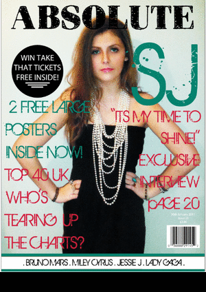
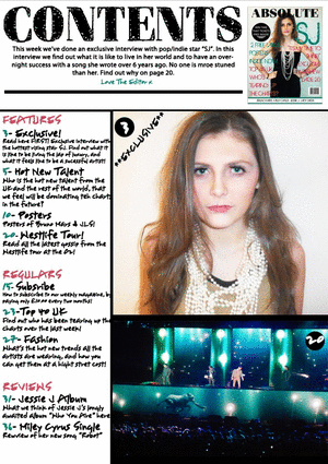
The first change I made to my contents page was to edit some of the text. I removed or changed some of the words so that most of the words were on the same line, and there was none on a line of their own. This provided more room, and ensured that the text did not look to bunched together.

Next I changed the order of the photographs. From feedback I received I put the picture of my model at the top, and the additional photo I took at the bottom. This way the whole page looks much more finished, and the model does not look like there is a huge block on top of her. It also fits as I have the colour green/ blue at the top of my page, and now I have it at the bottom.


MY CONTENTS PAGE NOW LOOKS LIKE THIS:

Sunday 13 March 2011

Grab Shots of Contents Page

To strart, I created my title saying "Contents" using the font Heartquake, just like the title on my front cover, I also kept the colour of it black to carry on my colour theme. I placed it at the top left corner, as from researching contents pages I found the title at the top left or top right.

Next, I divided the page into sections so that I could show where everything was supposed to be and so that everything was clear. I got this idea from all the magazines I looked at, therefore I decided to do this also. To create these dividers I used the rectangular maequee tool, and then used the fill bucket to make it black.


I then went onto create the introduction at the top from the editor, which I found that some magazines did. I created a text box then wrote what I wanted there and changed it to the font Myriad Pro. I made it the colour black to continue with my colour theme. I then wrote "Love The Editor x" underneath, but this time changed the font to Youngsook BTN, as it made it look more like a signature. I then changed it to the colour green that I had used on my font cover. In addition, I added another black divider using the rectangular marquee tool, as there was a big white space I need to fill.

I then moved onto to the rest of my text, which was the list of pages and what they are. I continued to use the font Youngsook BTN and continued using the same colours as my front cover, which was Black, Green and Pink. I got inspiration form all the magazines I researched, and therefore decided to use the sub-headings "Feautres", "Regulars" and "Reviews." I then had underneath these the pages which come under the correct section. For example "Westlife Tour" came under "Features", as it is only in the magazine for one time. I then had a brief description of what is on that page under the heading. I made the sub-headings pink, the page number green and the description with heading black
The next thing I did was something that I had seen on two of the magazines I researched, which was the front cover of the magazine featured on the contents page. I am not sure why it is there, but I liked the idea and included it anyway next to the introduction text, and felt that it looked appropriate. 


Afterwards, I added my photographs in which all magazines had, and some had more than one, therefore I decided to go with two photographs. One of my model and the other of something that links to one of my pages. I editied them both making them clearer and lighter.


I then used the followng features, which I had noticed the other magazines used. Using the font Youngsook BTN  I wrote the world "**EXLUSIVE**" on the bottom photo, to show that this photo linked to the exclusive interview that was being shown on the front. I then made two black circles on placed them at the top left hand of the photos, I then put a text box in the circles and wrote the page number using the font Youngsook BTN, and then made it white so hey stood out.


 HERE IS THE FINAL VERSION OF MY CONTENTS PAGE: