1) In what ways does your media product use, develop or challenge forms and conventions of real media products?
My media product challenges and develops forms of real media products, as firstly it has a title at the top of the page which associates with what the magazine is about. The magazine is about the different sporting activities in the school "Mountain Valley College", therefore I called the magazine "The Mountain Valley Review" I have called it this, as the reader will know it is for that school, and that it is a review of everything that has been happening there. I placed it at the top of the page, as it would be the first thing that catches the readers eye, so they will know immediately what magazine they are reading. I also have a title at the top of the contents page; which was simply "Contents" - which is used so that the reader knows what they are looking at. A contents page is always seen in a magazine, and is there for the reader too see what information is being told in the magazine and where they can find it.
Next, I used an image; which will always be seen on the front cover of a magazine. The image is usually used to give the reader an idea of what is spoke about inside the magazine- it will usually link to the text that is on the front cover. To get my image I took photographs of my younger brother playing badminton, as some of the text used in my front cover said "Results- Badminton Tournament" The idea of the image was that it was a student participating in the badminton tournament.
Headings are also always seen on the front of magazines, and I used quite a few for mine. All of them link to sport, and also give an idea of what will be in the contents page. For example " News! Student Wins GOLD!!" - this relates to sport and is a feauture on my contents page.
In addition, all magazine have a specific colour theme, as it makes the magazine seem focused and not confusing. For my magazine i used the colours purple, black, white and gold. I used these colours as they are all found within the image that I used- they all stand out, but also relate to the image.
Lastly, I included the Date of Issue and the Issue Number. Not all magazines include extras like this but some do. There can also be extras like the price and the date. These extras are just there to notify the reader how much the magazine cots, or around the time the magazine is set on.
2) How does your media product represent particular social groups?
The social group my media product represents are young boys and girls- specifcially in primary schools. However, it could also be for older men and women (parents) who want to know what achievments have happened in the school. It represents young girls and boys, as it shows all their sporting achievements, and what they can do if they do participate with sports. The image and all the headings link to the younger generation, which means it would attract that age group.
3) What kind of media institution might distribute your media product & why?
There are two main companies which are the most well-known for distributing magazines, these are Bauer Media and IPC Media. Bauer Media is Europes largest privatley owned publishing group. It is also a worldwide media empire, and offers over 300 magazines in 15 different countries, as well as being online, on TV and on radio stations. They mainly produce music magazines such as Kerrang and Q and celebrity gossip magazines, therefore I feel that this company would not be that appropriate for distributing my school magazine "The Mountain Valley Review."
The next company- IPC Media, I feel is more suitable for this school magazine. IPC Media produces over 60 well-known media brands, with print alone versions reaching almost two thirds of UK women and 42% of UK men, which is almost 26 million UK adults. This means that it produces a hight amount. It also has a corporate responsibility agenda that currently focuses on three main areas – community, environment and the collective input and action from the employees. This is why I feel that this would be most appropriatre for my school magazine, as they tend to publish magazines about the community which is what I would consider "The Mountain Valley Review" to come under.
4) Who would be the audience of your media product?
The audience of my magazine would be young boys and girls that are in primary school from the region of cornwall- as this is where the school is. This is the audience, as the magazine is about the achievements of young boys and girls from cornwall. However, this magazine could also have an audience of parents, as they would like too see what there children or family have achieved in school.
5) How did it attract/ address your audience?
There are a variety of different things I tried to attract/ address my audience. Firstly, I chose bold and bright colours to attract my target audience, which are young children- I felt that bright colours are usually more atttactive and interesting to them. Next, I chose to list things that would interest the children like competitions and prizes. I also included an individiual from the school winnning a gold medal- as I felt this would make people want to read it.
6) What have you learnt about technologies from the process of constructing this product?
Throughout the process of the preliminary task I learnt how to use a variety of different programmes. The first programme I learn to use was blogger. This was the very first thing we had to create so that we could show all our research and progress on. This programme was quite confusing at first, but I eventually learnt how to post and make the blog look attractrive. The next programme I learnt how to use was Photoshop. This programme was also very confusing at first, but after being taught the main features of it it became simple. We used this programme to edit the photographs, and make them look more proffesional and attractive. I learnt how to change the vibrance and brightness of the image, and also how to change things in the background. The last programme I learnt how to use was InDesign. This was where we actually made the magazine. This programme was very similar to Photoshop, therefore I did not have to start from the beginning to use the programme. With this programme I learnt how to make something that looks like a magazine, use and play with a variety of differnet fonts and colours and also create text.
Showing posts with label Preliminary Task. Show all posts
Showing posts with label Preliminary Task. Show all posts
Sunday, 2 January 2011
Tuesday, 23 November 2010
Final Magazine- Contents Page

This is my final design for my contents page. Once again i have followed the rules of thirds, to keep things equal. For my title, i have made it the same colour as the jumper on the picture of my model, so that it all links together. The second picture i have used has been circled to make the page more interesting and to make it different. I have used the colour black for my text, as it is easy to read and also partially links to the pictures. I am not too sure about this contents page, as I was not sure what to put on this page or how to make it look even.

This is my new and improved version. I have made the text into a thinner line, so that is applies to the rules of thirds more. I also moved the text to the other side so that I could have the photo of my model facing inwards, therefore introducing the reader into the magazine.
Thursday, 18 November 2010
Final Magazine- Front Cover

This is the final design for the front cover of my magazine. I have used the rule of thirds so that everything looks equal, however because my photograph does not follow the rule of thirds i have to change some of it around. I tried to keep to a limited amount of colours,as if there are too many colour it gets confusing, so i stuck with white from the top, gold from the racket, purple from the jumper and black from the trousers/shoes. All of the text is linked to what is mentioned in the context page, just like the photograph.

This is my improved version, and very final. I removed some of the text, as it appeared too busy, it is easier to focus, when there is less things present.
Sunday, 31 October 2010
Contents page research
 This is the first contents page i found and my inital thought is that it is very simple yet bold. The bright colour really catches your eye, but has little relevance to the photograph. The overlapping titles is too busy and distracting, and makes it hard to read what the say. The picture does not really fit with the magazine, as it looks like too people just standing there, so for my contects i will make the photo relevant.
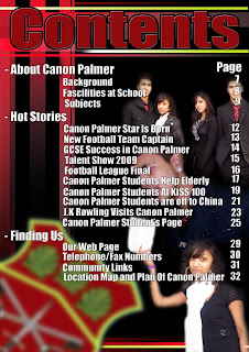 This content page immediately gives the impression that there is too much going on, you dont know where to look first. There are too many seperate photos in the background it does not have a specific area, and is it hard to tell what the photos are actually showing due to the white, bright writing going over the top. However, the title is the same colour as the badge in the left corner which links them together and looks better than if it was a colour that was not there.
Researching photo's

This is the first photo I found, and I immediately liked it. The background is blurred out which makes the main focus the young boy with the racket. The photo has a cheerful feel to it, even though the colours are quite simple. However, the second person right at the front of the camera that is blurred, is distracting and feels like it is blocking the picutre.

I also like this picture, as firstly it fits in with the theme of my magazine, which is a sports magazine. The picture is clear and shows exactly what is happening, which is that they are in a fooball match. I wouldnt try to copy this photo, because it would be too hard to recreate, but it would fit in nicely with a sports school magazine.
Monday, 11 October 2010
Newest Picture


Monday, 4 October 2010
Example of photoshopped picture


Monday, 27 September 2010
Picture Ideas


Friday, 24 September 2010
Headings For Magazine


Tuesday, 14 September 2010
Magazine Research

 This magazine is relatively good, as it gives an idea of what the school specialises in, as the front page is just of teenagers doing art. It also has a simple side shot of the girl, and clearly shows what she is doing. The paint brush it hard to see, as the colours blend in together, so initially we are not sure whether she is paining or not. The italic font in hard to understand, and some of it is very small which means that people may not know what exactly is in the magazine by reading that. Even though there are positives to this magazine, the overall image is very boring for me, so I will try to avoid this type of magazine when I do mine
Subscribe to:
Posts (Atom)