FRONT COVER
My media product challenges and develops forms of real media products in a variety of different ways. Firstly, it follows the idea of the title being placed directly at the top of the magazine. The name I went with for my magazine was “ABSOLUTE”, as I felt the name associated with the idea that you can find out completely everything in this magazine. I chose the font HEARTQUAKE to use, as I felt it stood out and was edgy yet sophisticated witch related to the theme of my magazine. In addition I made it the colour black, as it stands out and is a colour that will catch the reader’s attention. It was also the most attention seeking colour that was within my colour theme, which was BLACK, GREEN and PINK. I used these colours, because they are sophisticated colours that work well together and also, the target audience for my magazine is for female teenagers/ young adults, therefore I felt these colours would attract them. I went with all of these ideas as I felt that all of the music magazines I looked into, the title were one of the first things you notice, because they stand out wit the type of font used, and the colour.


Furthermore, every magazine follows the idea of having one artists or a group as the main focus on the front cover, which I also did. I decided to go for a single artist like all of the magazines I researched. I did two different photo shoot’s to get the photos I wanted, and aimed for a tasteful and classy yet vulnerable/moody look. I got this idea from the magazines such as ROLLING STONE and BILLBOARD, who used artists such as Shakira and Lady Gaga in a very simply way. The clothes they are wearing are all mainly black, which gives the suggestion that it is quite rocky; therefore I dressed my model in similar black clothing. I also noticed that the models are almost always staring straight on at the camera, and have been photographed at a medium long shot- so that most of their body is included in the photo.

When looking at well-known music magazines, I noticed a few features that t hey all seem to have. The majority have text on either side of the model with their either being lots but small or not much text but large and over lapping the model. For my magazine I decided to follow the idea of the Rolling Stones magazine which had large text overlapping the model. The font I used for this was “BIRTH OF A HERO” which was originally going to be my main title font, but instead I used it for my text. I felt this font was edgy yet easy to read, and also the colour pink was right for this part of the magazine.

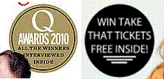
Lastly, I did a banner at the bottom of the page, as even though I did not show it in my research I did find quite a few magazines with these banners, which have names of artists along it. A magazine that did use this that I looked at was Q. I felt this was a good idea, as it shows which artists will be featured in the magazine, and can be read easily. So if the reader can see who is featured in the banner, and they like them then they will purchase the magazine.

Contents

Here are the two magazines I recieved most of my inspiration from. I took snippets from both of them and additional magazines I researched to create mine.
Heading: By looking at these two magazines and the rest of them, I noticed that they have a heading at the top of the page saying "Contents" which I also decided to do, as it confirms what the page is to the reader.
Introduction with image of magazine: At the top of the my contents page I decided to do a message from the editor with an image of the front cover. The kerrang magazine did this and I felt that it was good idea, as it tells what is included in the magazine, and also makes the magazine more personal- if there is a message from the person who made it.
Images: Both of these magazines have more than one image. The first image I used is the main one and therefore made it bigger like the two magazines used. The second image I used was an image from the Westlife Concert I went to a couple of weeks ago which is less important, therefore I made it smaller.
Text: I noticed from the two magazines, that they had sub-headings like "Features" and "This Week", therefore I also deicded to do this, as I felt it makes the pages you want to read easier to find- as if it is a regular feature in the magazine then you look under "Regular". Furthermore, I picked out that they have a short brief of what is included in that page underneath the page number, so I did this also.
Page Numbers: Lastly, on both magazines somewhere on the images that have a page number which simply indicates what page that image/ story will be on, so I did this also- as it creates another easy way to find what you are looking for.
Double Page Spread

Here is the magazine I recieved bascially all my inspiration from:

No comments:
Post a Comment