Friday 28 January 2011

Draft Of Front Cover

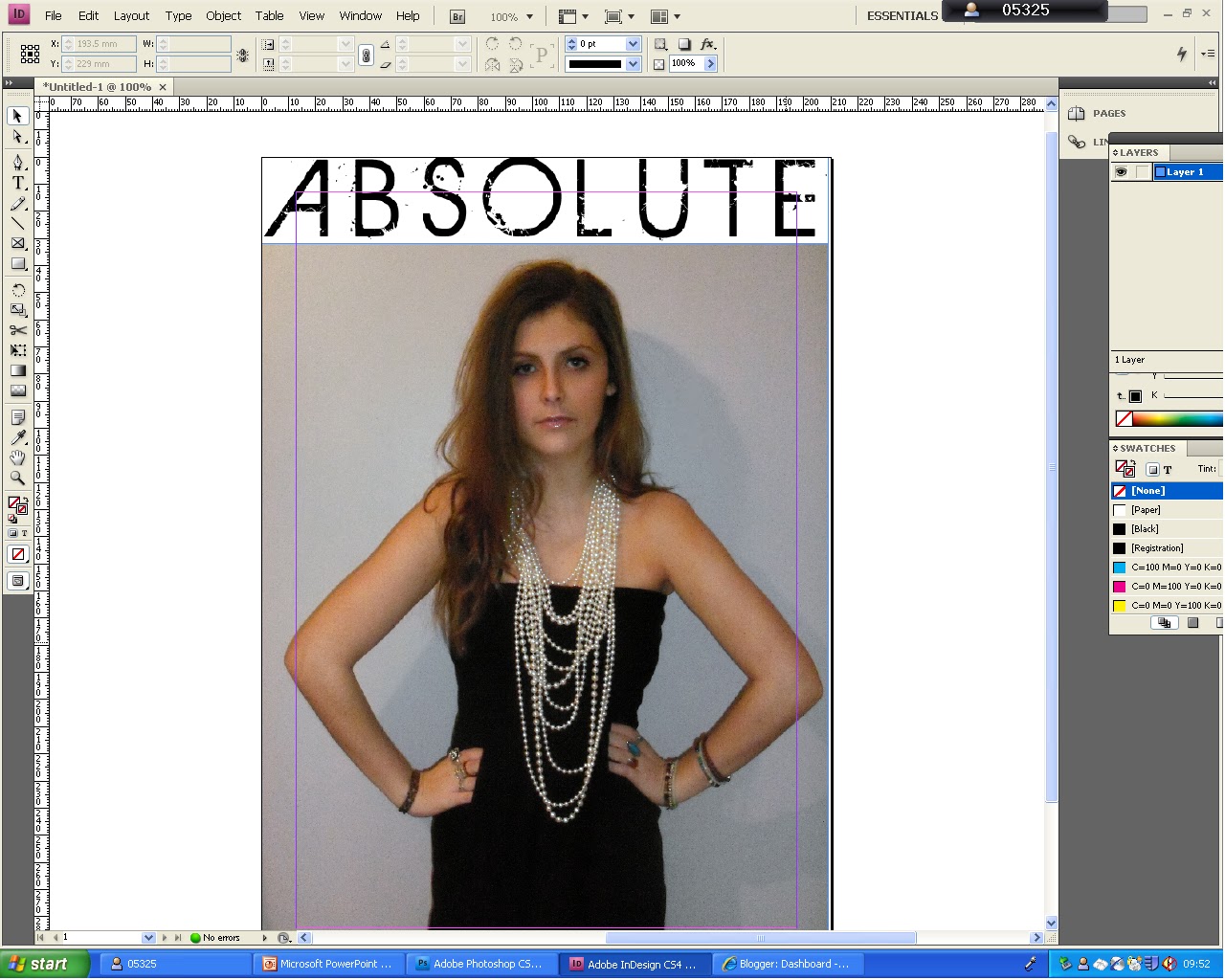
To create my magazine front cover I used photoshop, as I felt it would be the easiest and most appropriate program to use.

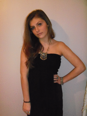
I started off with placing the main image that will be on my magazine. By clicking File, Place, The Image, and then placing it to cover the whole A4 sheet.


Next, I added my title to the top of the sheet, which i had already decided on what it would be. Which was white and in the font Delphi SF. I did this by creating a text box using the Horizontal Type tool, chose my font, and then typed in the word "ABSOLUTE".


I then went on too add a cirlce to the left of the image to so that i could put the text "WIN TICKETS TO TAKE THAT, FREE INSIDE" inside of it. To make this circle i used the Elipse tool, as shown in the print screen.


I then added the text into the cirlce using the horizontal text tool. I changed the font too Myriad Pro and the colour to white to fit the colour theme of my magazine. I also added some lines underneath the text using the
rectangular marquee tool, and then using the fill tool, to make it white.


I then moved on too add the name of the person the magazine is about to the right of the image. I decided to name my model "SJ" as it is very similar to my models name and is also very catchy and edgy. I used my orginal main font called "Birth of a Hero" for this text, and made the colour of it a green/blue colour which matches some of her jewellery. I then made it to the size 350pt so that it stands out from the additional bits on the magazine.


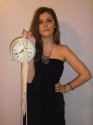
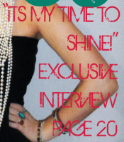
Next, I added more text underneath the text "SJ". In this text I decided to write "Its my time to shine! Exclusive Interview Page 20." I felt this was relavent to some of the photos I have for my magazine, as in some photos I have my model holding a clock- which links with the time in the text. Once again I used the Horizontal text tool, and the "Birth Of A Hero" text, and made the colour pinkish, like the colour of her lips.


In addition, I found a picture of a barcode on the internet, saved it and then used "Place" again to place it at the bottom of the right hand side. I then used the horizonral text tool to place writing "30th January 2011, Issue 21, £3.00" above it. I kept the colours to white.


I then added a banner to the bottom of the page, by using the rectangular marquee tool. I create the main bit and filled it in white. I then did two smaller boxes, one at the top and one at the bottom. I filled these ones in a browny colour, which I got the idea from the colour of her skin. I then used the text tool, to write the names of musicians that are featured in my magazine which are "Bruno Mars, Miley Cyrus, Jessie J and Lady Gaga."


The last thing I did was to add more text, this time down the left side. I looked at some magazines, and the text they have on their magazine. I decided to use the text "2 free large posters inside now!" and "Top 40 UK, Who's tearing up the charts?" as I felt these were relavent to a music magazine. I chose the font Adobe Caslon Pro temporarily, as I did not know what other font to use at that moment. I put the first bit of text in the green/ blue colour and the other half in the pink colour.

HERE IS THE FIRST DRAFT OF THE MAGAZINE I CAME UP WITH:

Change In Font For Title

Here is my first attempt at doing my front cover. I placed the picture so that it covered the whole A4 sheet. I then added the title to it, however i am not happy with how it turned out, as the title has a white background which does not match the background of the picutre.
Therefore, I decided to use a font from photoshop and add it to the magazine there.

Here is the font I used, it is called Delphi SF:


I feel this font is much more appropriate for the magazine, and does not have an additional background to it.


I am unsure whether to use black or white for the colour of my title. Both colours relate to the photo, as the black links to the dress, but the white links to the pearl necklace. However, I feel that the white would be more effective for this magazine, as it is more noticable and you can read the words more clearly

Thursday 27 January 2011

Second Photoshoot

To start my second photoshoot, I began simple. I decided to stick with the theme of my model wearing all black, as this is what I originally researched at the beginning. I made her wear very bold and statement jewellery- as I wanted to make the image more interesting, as she is wearing very simple clothing. I started with small silver jewellery, but decided to go one step further and changed it to a large white beaded necklace. In addition, for my second photoshoot I moved to a different room with a whiter wall, so that everything appeared more brigher, and I also used the flash on the camera.

make avatar

I then decided to add some props. For my first prop I chose a clock, as I had decided that for my front cover I was going to use the quote "Its my time to shine!" - and I felt that the clock played in nicley with this. I had used this prop in my first photoshoot, however the two photographs I did were not perfect, as the flash was shining in the camera. Therefore, for this one I had to ensure that this did not happen.

make avatar

I went on to use two more props- a staw hat and a guitar. I used the guitar, as the magazine is a music one, and I wanted to give my artist the feeling of a soulful music artist. The hat was experimental object, but I liked the photo's as it give it quite and quirky and young edge to the images.

make a gif

Lastly, I removed the props and decided to work with what she was wearing. I did a few shots of her pulling up her collar to give quite a moody feel to the shot- which is what I was aiming for in most of them. I then made my model put on the white beads again and work with them. We trired a few shots of her looking through the beads- this was quite hard to get right, but was an interesting idea to do.
animated gif maker

Monday 17 January 2011

Magazine Name ideas.

For the name of my magazine i chose names that mostly relate to music, for example "Insight", it gives the impression that the magazine gives you a look (insight) into the music world. I came up with 3, these are:
  • Absolute
  • Insight
  • Inherit
I then visited the website http://www.dafont.com/ which is where i chose my font from and put these names into it, to see which one looks best.


I like all three of these names, even though my most preferable is "INSIGHT" as it gives the idea of the magazine being an insight into the music world. However, there is a magazine already with this name, but is based on life and leisure not music- therefore i could still consider using this.

To make the dont a bit larger and make them more easy to read, I considered putting a gap between each letter.


After carefully analysying and asking my peers what title is best, i have decided to go with"Absolute." Firstly, because "Insight" is already a magazine name, and "Inherit" comes out quite straight and bland with the type of font I am using.

CHOSEN TITLE


Tuesday 11 January 2011

Monday 10 January 2011

First Set Of Photos

 This is the first photo I started with- I liked it at first, however I realised that it does not really fit in with my theme, of being quite moody and vulnerable. The outfit I used, is supposed to create quite a rocky and edgy feel, but is also sophisticated. I made sure the makeup was visible, but not too eyecatching. I used fake eyelashes to bring out her eyes more.


With, these two photos here I used two props, which was a clock and lots of beady necklaces. With the first photo, the props turned out better, as they are clear and there is no light reflecting from the front of the clock. However, the feeling that her face is proposing, is not what I am aiming for, because it gives quite a cheerful mood. On the other hand, in the second photo- her face is in a position which gives an extremely moody feel- which is what i was aiming for. Therefore, in my second shots, I shall use the props again, but try to make sure there is no light reflecting and that she is doing the correct face. If this turns out correctly, then this could be a possible cover photo.


I also really like this photo, as it is also quite moody, even though it is not 3/4 of the body- so i can not use it as my front cover image. This time, we put the beads around her nexh, which gives the idea of statement jewellery.

 I really like this photo, we changed the outfit which not creates a more soft and vulnerable feeling. The dress and tights- are very soft colours which creates the feel of vulnerability, but i also inlcluded the the grey leather jacket, which makes the outfit seem more rocky. I used the prop of a guitar in this photo- as it is a music magazine. Along with the position of her face, which is sideways- the photo gives the idea of a gentle, vulnerable singer/ songwriter.


 I also really like this photograph, the action she is doing, the sunglasses and the position of her face, automatically creates a rocky and moody feeling. However, the lighting has gone wrong, as one side has become quite orange. When she is facing sideways- it creates a very gentle and vulnerable feeling, and when she is facing straight on, it is quite hard; therefore creating a moody and  tough type image. This is another possibility, for my front cover, although i would like to try and re-create this shot in my second lot of photos.


I decided to try something different, and changed the settings of my camera to black and white. I do not think I will use any of these photo's- as the black and white makes the photo quite bland, and un-exciting. However, in the second photo i like the pose that she is doing- it creates a shape which once again creates the idea she is tough. In my second shots, I will try and use this pose again, but in normal colour. This also applies for the first photo, even though the position creates a different type of feeling, it still creates one- which is the vulnerbale, gentle and thoughtful feeling.

ADDITIONAL PHOTO'S


For my second shot of photo's i will be borrowing the school camera, so that the quality of picture will be better and less pixelated/ bland. I will also be concentrating on trying to control the lighting, so that there are no shadows or darker/lighter parts.

Font Research

Here are a few different fonts that I like for being the Title of my magazine. I have decided to stay with the colour of it being black, as it fits with the theme of my magazine.

I really like this font, because even though it is just bold and black, the eroded effect adds interest to it, and makes it more appropriate for a rocky magazine.
I do not like this one as much, however i like the glittery effect, as it creates the feeling of showbiz and celebirty, which is the idea of the magazine.

I like this font, because of the little flowerly patterns at the side- which give a quite girly and feminine feel to, which the magazine would be targeted to a move feminine audience.
This font is quite playful, which makes me like it, however it is not very eye catching and does not really stand out- which is what we want for a magazine; for it to stand out from the rest.

This font is slightly different to the previous ones, in the way that the letters are much thinner. It has an eroded effect, which i like and once again gives a rocky feel.

Conclusion
After carefully considering the font, and asking some of my peers, I have come to the descion to use Font 5. The font is not too bold, but is still eye-catching, due to its interesting eroded effect.

Monday 3 January 2011

Mood Board

Here is the mood board I created for ideas on my photos I will be taking. It is focused on what my model will be wearing- which is very rocky and sophisticated clothing- with lots of accessories.

Sunday 2 January 2011

Image Research

I have chosen Miley Cyrus as someone to look at as she shares some similariteis to the model that I will be using.


These pictures are based on a rocky theme- which what I am aiming for. They also incorporate a few bits of jewellery which i also intend to include with my photographs. The long shot photo is mainly focused on what she is wearing which adds attitude and moodiness to the picture. The 1st photograph is a mid-shot where you can see more of the emotion on the face and even though she looks quite moody it adds a vulnerbale feeling.


These two photographs also have a moody and rocky edge to them. In the first and last one she is looking quite thoughtful which adds the feeling of the magazine. In the first photo, she is covering herself with a curtain whilst looking thoughtful suggesting that she is hiding away. The second photo has a lot of attitude and she is looking straight into the cmera making her quite intimidating- the room adds to this feeling as it is quite plan yet eerie. Within both- pictures her clothing and make-up has a rocky feel to it- as she is wearing mostly black and leather. She also has statement jewellery on which gives the idea of her personallity.

Main Task- Music Magazine Research


I like this front cover, because it is very sophisticated yet has a rocky edge to it. The lighting used makes her face stand out and brings out her eyes. She is wearing all black which can sometimes take over the whole photo- therefore the lighting could be used to make sure that this does not happen. The prop used is the letter “M” which links to the magazine and adds interest. The background is a pale simple colour- which makes the main focus of the front cover stand out which is her. Lastly, the front cover follows the rule of thirds- her head is placed perfectly in the centre which makes the front cover more even. The tile is all along the top of the magazine and is placed behind the models head, however I do not like this, as you can not read the whole title. If someone had never seen this magazine before, they would not know what the name is. The magazine also has a barcode down in the right hand corner with white writing above it. This magazine also has the text written down both sides of her in the gaps, in colours that match the rest of the magazine.The name of the model is placed in the centre and is going right across, which will catch the readers attention immediately, which gives me the impression that the models name in very important for the magazine and should be seen. There is also a little caption underneath the name which gives a brief idea of what they talk about in the magazine,

Just like the first magazine, this has a rocky style to it; however the model still looks presentable and sophisticated.  A fan has been used to create the idea that she is walking and to give the photograph an elegant look. The lighting has been used to show her face more clearly, and it fit in the with light mood and light background. She could also be wearing all black in contrast with the background and to make her stand out. The pose seems semi-natural, and is a bit plain and simple, but is quite effective, as it adds elegance once again. The whole colour theme is black and white which gives quite a elegant yer simple feel to the magazine. Once again the model is in the centre taking most of the attention, and the title is placed at the top, but behind the model. The main text here is "Can Shakira conquer the World?" which links to the model. The word "Shakira" is bigger and stands out the most as it is the name of te model. Additionally, just like the first magazine the text is down the right and left hand side of the model. There is also a stamp type thing at the top right hand side of the page in black and white which is advertising global warming. I like this idea of the stamp and may include it, however I may change it to a circles, as I feel that the sqaure is too sharp. A circle would give a much more softer feeling.
For example, one like this which would featured on a Q magazine front cover:


This one still has a rocky edge to it, however instead of being sophisticated it is quite intimidating and quite sexual. The wig used gives the magazine quite a funky feel to it, and makes it different. What she is wearing creates a statement about who she is which is quite confident and likes to wear clothes that will attract attention. The colour of her skin has been made quite tanned and gives her a glow- it also adds more colour to the front cover. I picked this magazine to look at as she has some statement jewellery on her hand, which catches quite a bit of attention, therefore I may consider using this when taking photos of my model, without making it too chunky.