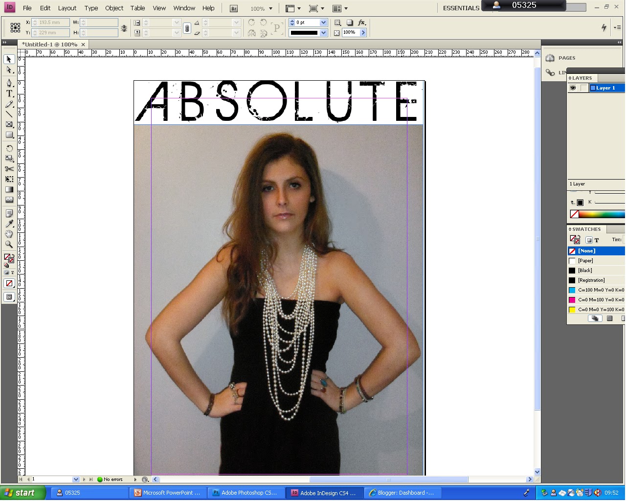
Here is my first attempt at doing my front cover. I placed the picture so that it covered the whole A4 sheet. I then added the title to it, however i am not happy with how it turned out, as the title has a white background which does not match the background of the picutre.
Therefore, I decided to use a font from photoshop and add it to the magazine there.
Here is the font I used, it is called Delphi SF:

I feel this font is much more appropriate for the magazine, and does not have an additional background to it.

I am unsure whether to use black or white for the colour of my title. Both colours relate to the photo, as the black links to the dress, but the white links to the pearl necklace. However, I feel that the white would be more effective for this magazine, as it is more noticable and you can read the words more clearly
No comments:
Post a Comment